Workforce Management · International Edition · Self-Directed Project
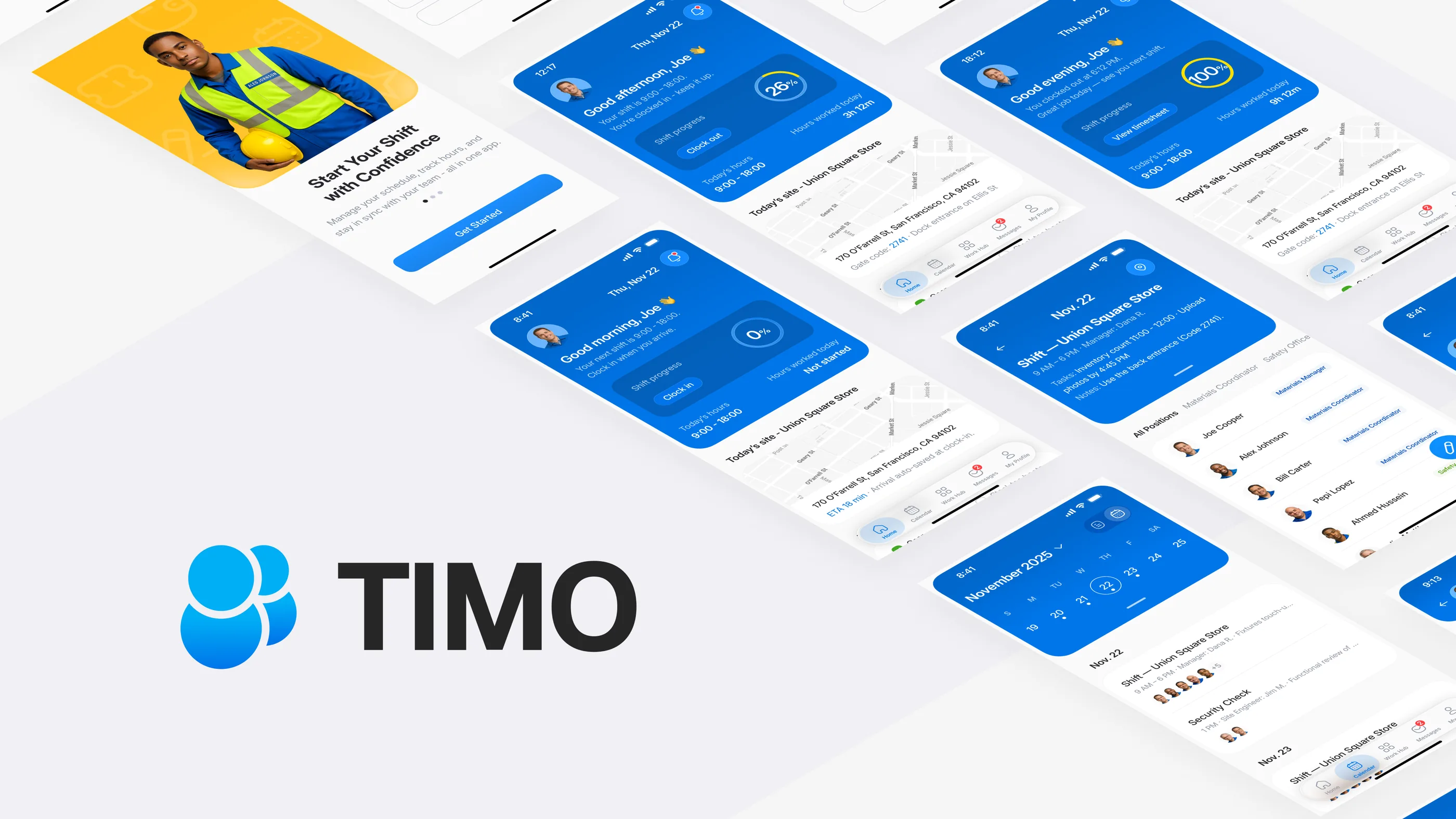
Timo: International Edition for the Global Deskless Workforce
A 2-week self-directed redesign of the parent Timo product for teams outside China. The international edition is built to replace dense shortcuts with clearer steps, digital receipts, and audit trails for operators who need records they can explain.
Self-directed redesign · 2 weeks · No production deployment. Outcomes describe design intent, not measured results.
- Domain
- B2B SaaS · Workforce Management · International / Compliance
- Deliverables
- Mobile App · UX System · Localized Patterns
- Scope
- Information Architecture · Interaction & Visual Design · Prototyping
- Timeline
- 2 weeks (Research → Prototype)
Why an international edition
What changes when the audience changes
The parent product, Timo for Silver Light, was tuned for Chinese-market staff: dense iconography, stacked badges, and shortcuts that power users could read in one glance. That density works in a high-context market. It breaks outside one. Operators outside China, and the managers they answer to, need clear steps and records they can explain on the spot, not implicit fluency.
The international edition is not a translation. It is a structural redesign of the same parent product around audit-ready receipts, one-task screens, and cultural adaptation. Each one answers a risk the V1 super-app density carried out of China into a market that punishes ambiguity.
The challenge
The high cost of low trust
- Cognitive overload. When I walked through V1 as a low-context user, icon-only navigation and stacked badges forced me to guess. Crews hesitated. Shifts slowed.
- Trust gap. Mixed permissions, offline drops, and missing receipts left payroll unable to defend entries. The problem surfaces the moment a manager asks “show me the record.”
- Physical constraints. Fitts’ Law violations like tiny tap targets and two-handed gestures made the app unusable for gloved workers on the move. The interaction model assumed a desk. The work happens on a kitchen line.
My redesign swaps dense shortcuts for plain labels and one-handed flows, each backed by a digital receipt that holds up when connectivity drops.
Design principles
One-handed flows for deskless teams
- Fitts’ Law in the field. I sized primary actions at ≥48 pt and placed them inside the thumb zone, so gloved workers act without breaking stride. Mis-taps and retries drop.
- Offline receipts. Every punch, correction, and roster change generates a digital receipt that syncs the instant connectivity returns. Payroll stays defensible even when the warehouse Wi-Fi drops.
- Cognitive load reduction. I cut each screen to one intent, wrote in plain language, and added progressive disclosure so low-context crews stay oriented while managers keep their power. Common tasks finish without extra training.
The solution
Rebuilding trust through auditability
I built the IA around five zones, Home, Shifts, Requests, Messages, Profile, so every action has one place to happen and one record to check. Employees see fewer choices. HQ sees an audit trail for every change. The shape isn’t novel. The discipline is making sure no action falls between zones.
Feature
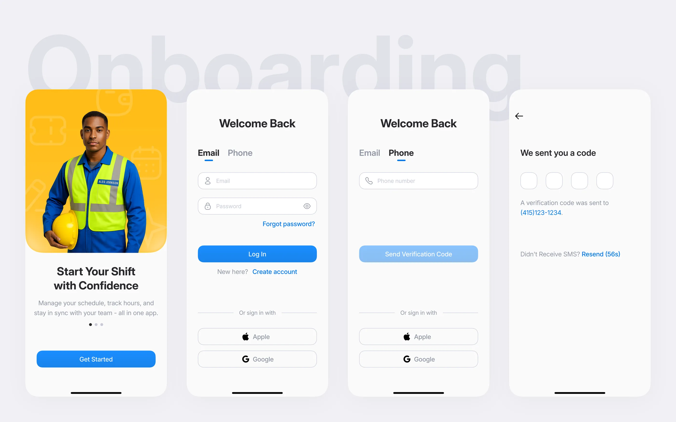
Compliance-first onboarding
I put compliance at the entry point. A worker proves location, acknowledges policy, and confirms identity before they ever see their shift. The first interaction with the product becomes the first record on the audit trail.
Feature
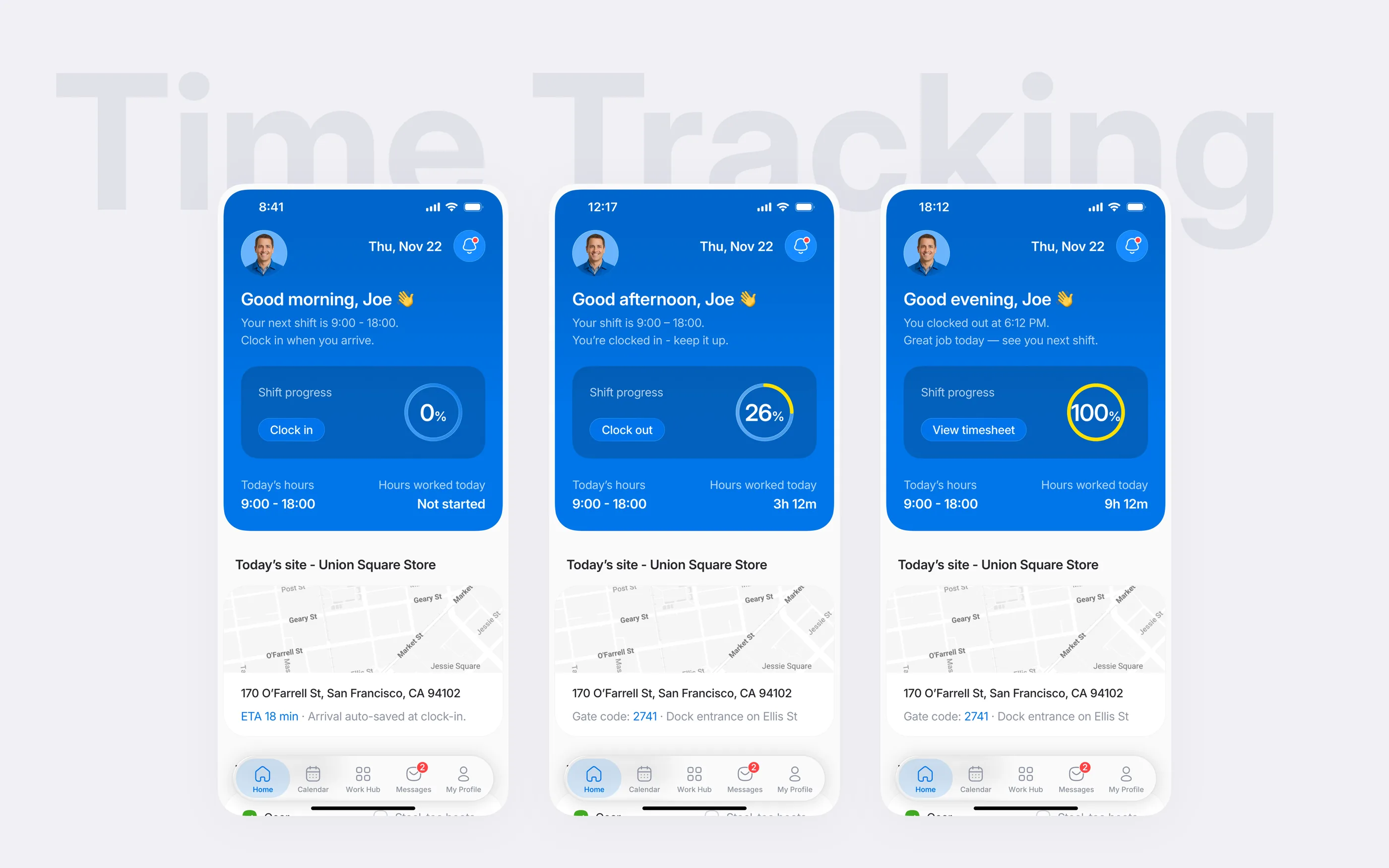
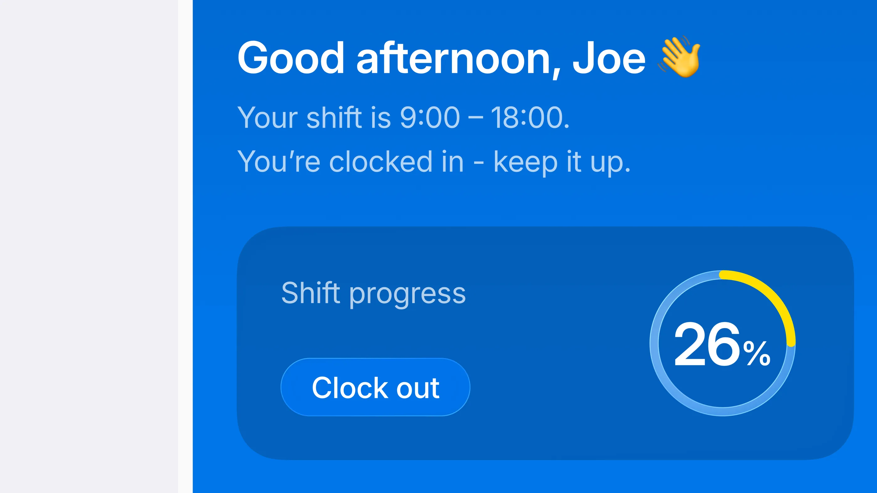
Ergonomic clock-in & clock-out
The one-thumb interaction is where Fitts’ Law pays off. I put a single CTA inside the thumb zone, framed by compliance cues and shift context. Workers record time on the go with one tap. The system writes an auditable digital receipt to payroll, and the worker never has to see the ledger.
Feature
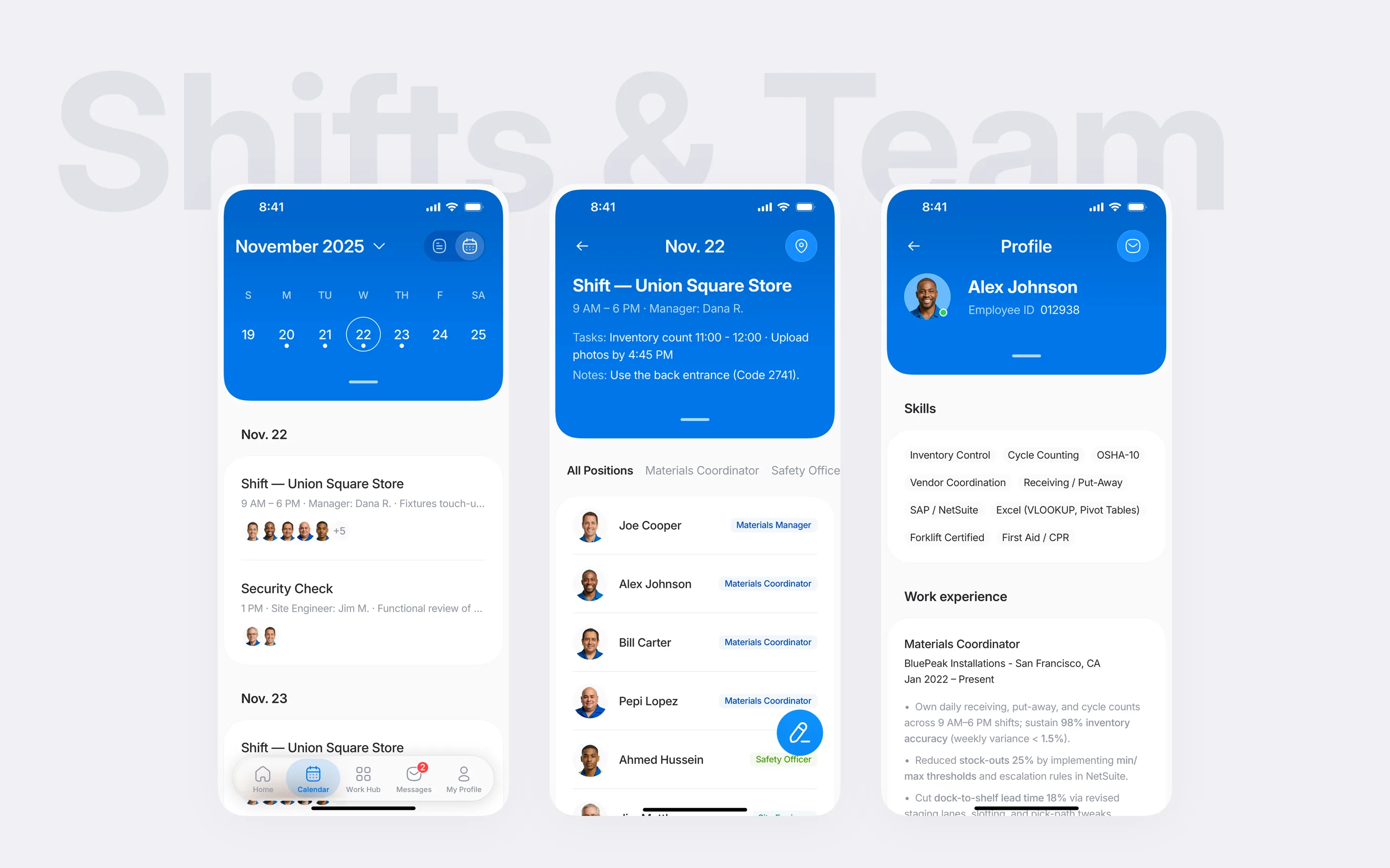
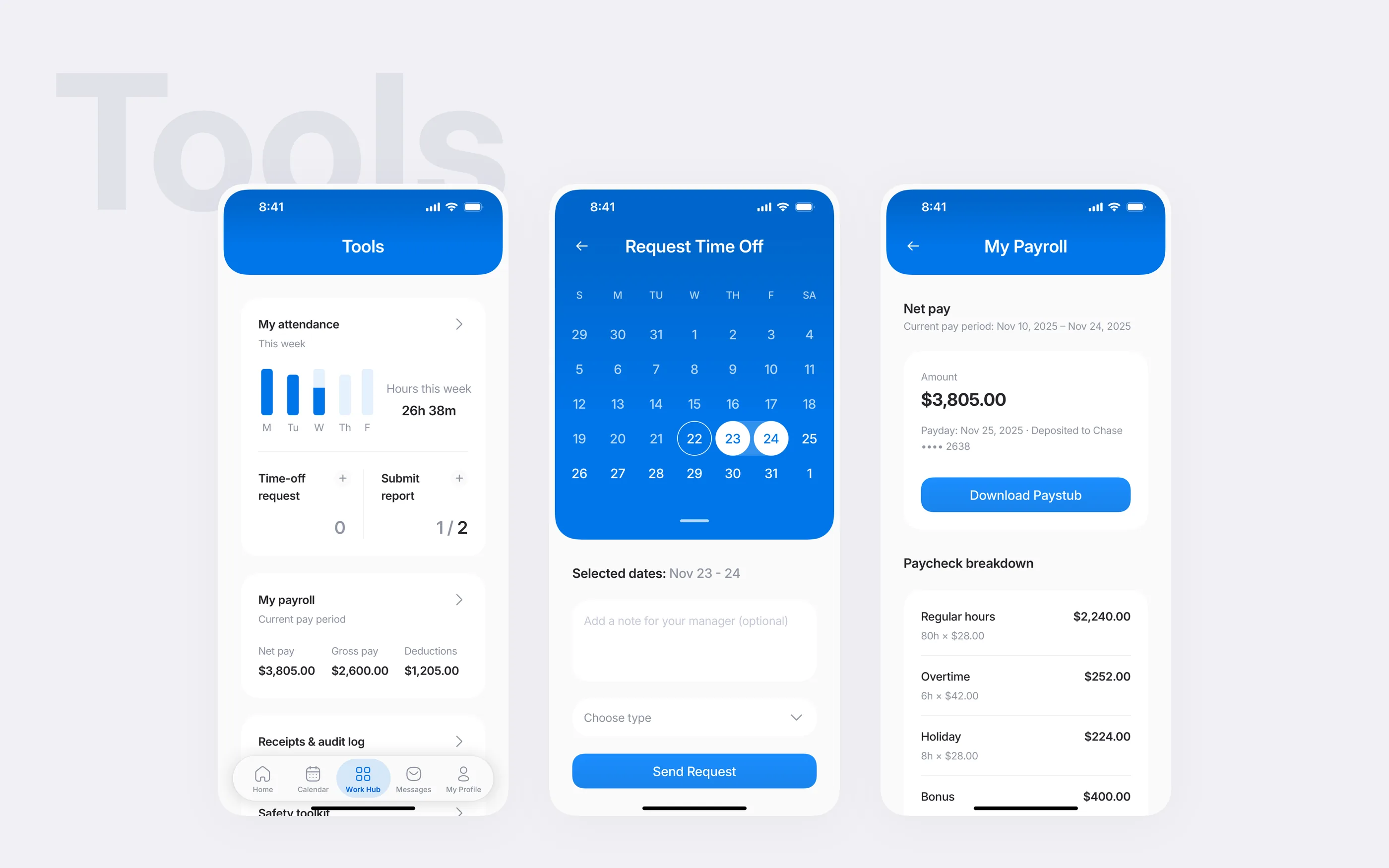
Audit-backed scheduling & team roster
I paired a timeline view with signed records so audit trails read top-to-bottom in chronological order. Every punch, correction, and approval lands on the same shared ledger. Crews, managers, and payroll check one source of truth instead of three.
Feature
Payroll & ops transparency
I designed the trust dashboard as one transparency hub for employees and managers, with certifications, pay periods, devices, and outstanding actions in one place. Critical data stays at the top. Deep-dive cards open compliance tasks when needed. Crews stop pinging HR for status because the status is already in front of them.
Feature
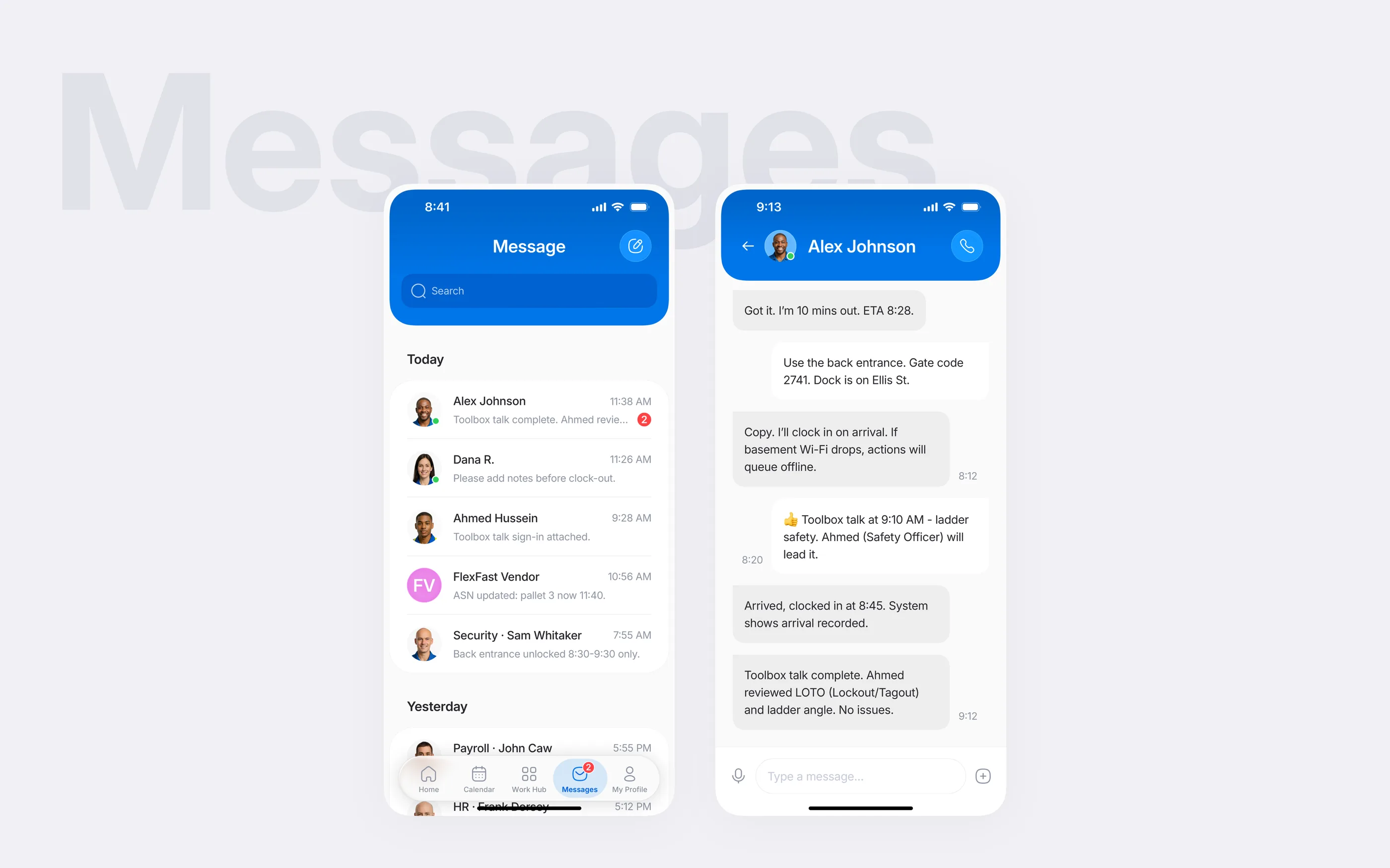
Keeping messages tied to records
I kept messages attached to roster data, location, and audit trails. Supervisors resolve issues inside the workflow instead of in back-channel chats. When an issue does escalate, the conversation already carries the evidence with it.
Adaptation signals
Trust signals in the international edition
- Payroll defensibility. Trust receipts head off conflict. Ambiguous time logs become audit-ready records a manager can explain on the spot. Qualitative judgment, not measured in a deployment.
- Task flow. Single-intent screens and ergonomic controls are built to keep frontline crews moving at peak. Qualitative, not measured in a deployment.
- Audit posture. Auditable workflows move the review conversation from “show me your process” to “show me your audit log.” Qualitative, not measured in a deployment.
Visual language
Making trust visible in daily screens
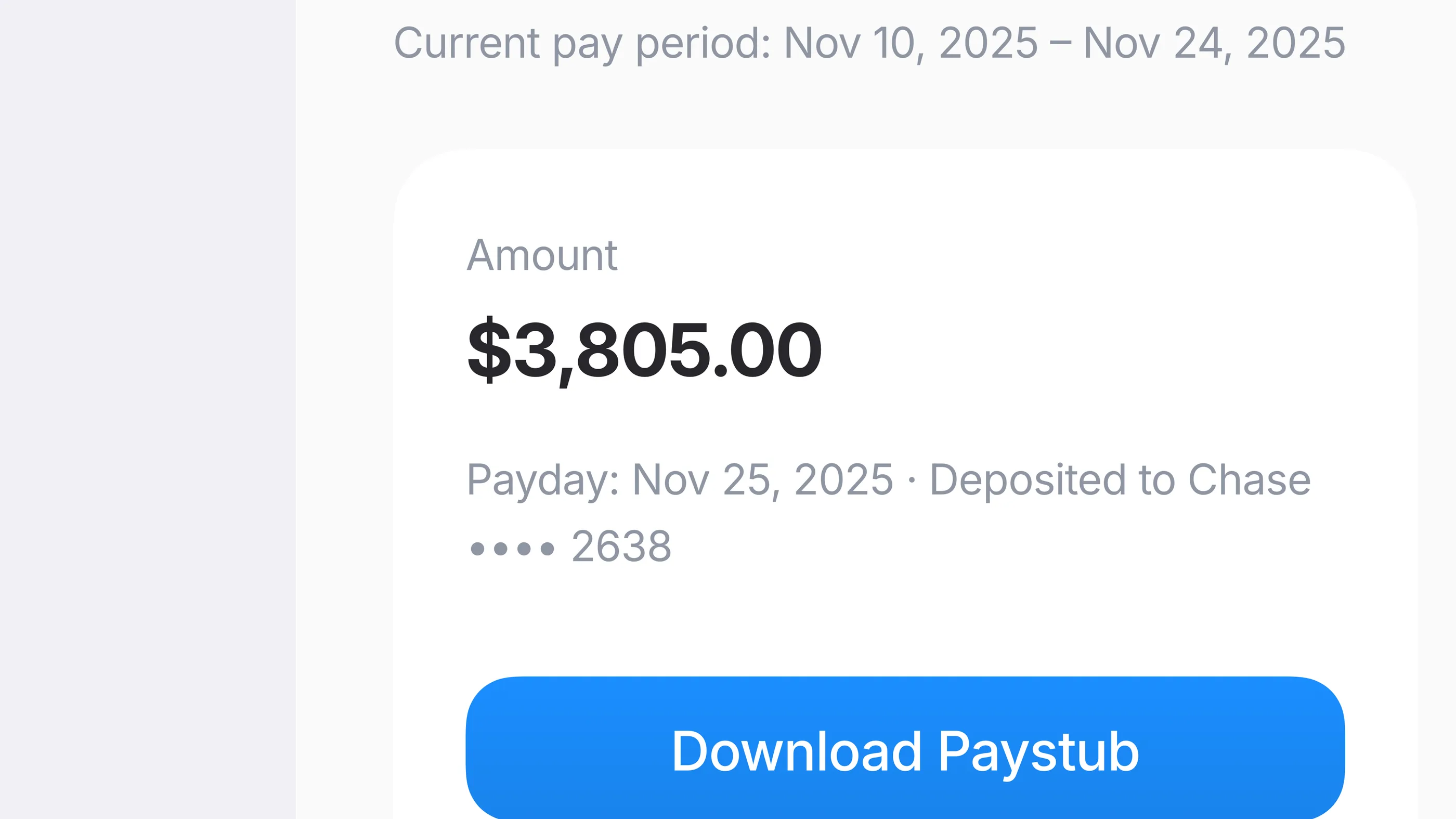
The visual system keeps trust signals in view with calm neutrals, one electric-blue accent, Inter type, and clear status states. The details below show clock-in progress, contextual messaging, and pay summaries in the international edition.
What I carry forward
Designing for auditability taught me that the most important UX is often the one that leaves a paper trail. When a product records accountability as it goes, users hold the evidence before they act.