AI Prototyping · 2-Day Experiment
Glance: Where AI Direction Delivers, and Where It Stops
A two-day experiment in AI-assisted design. He built Glance, a working news dashboard in Next.js, by directing Claude Code through Figma MCP across five rounds. This case shows the prompts he wrote, the screens he accepted, and the places where he stopped and fixed the code himself.
A live briefing he built and coded, AI-curated across six publications · EN / 中 · updated manually
- Domain
- Editorial Dashboard · News Aggregation · Bilingual Content
- Deliverables
- Working Next.js Prototype · Design System · 5-Round Iteration Log
- Scope
- Product Definition · UX/UI · Typography · Code Direction · QA
- Timeline
- Concept → v3.7 Final · 2 days
Why I built this
A two-day exercise in AI-assisted design
I made Glance because mornings kept getting away from me. I'd open five news sites to catch the handful of things I actually needed, and twenty minutes later I'd be lost in a feed, no closer to caught up. Finding the news had gotten noisier than the news itself. So I built the version I wanted: one place, a smaller surface, only the stories worth reading.
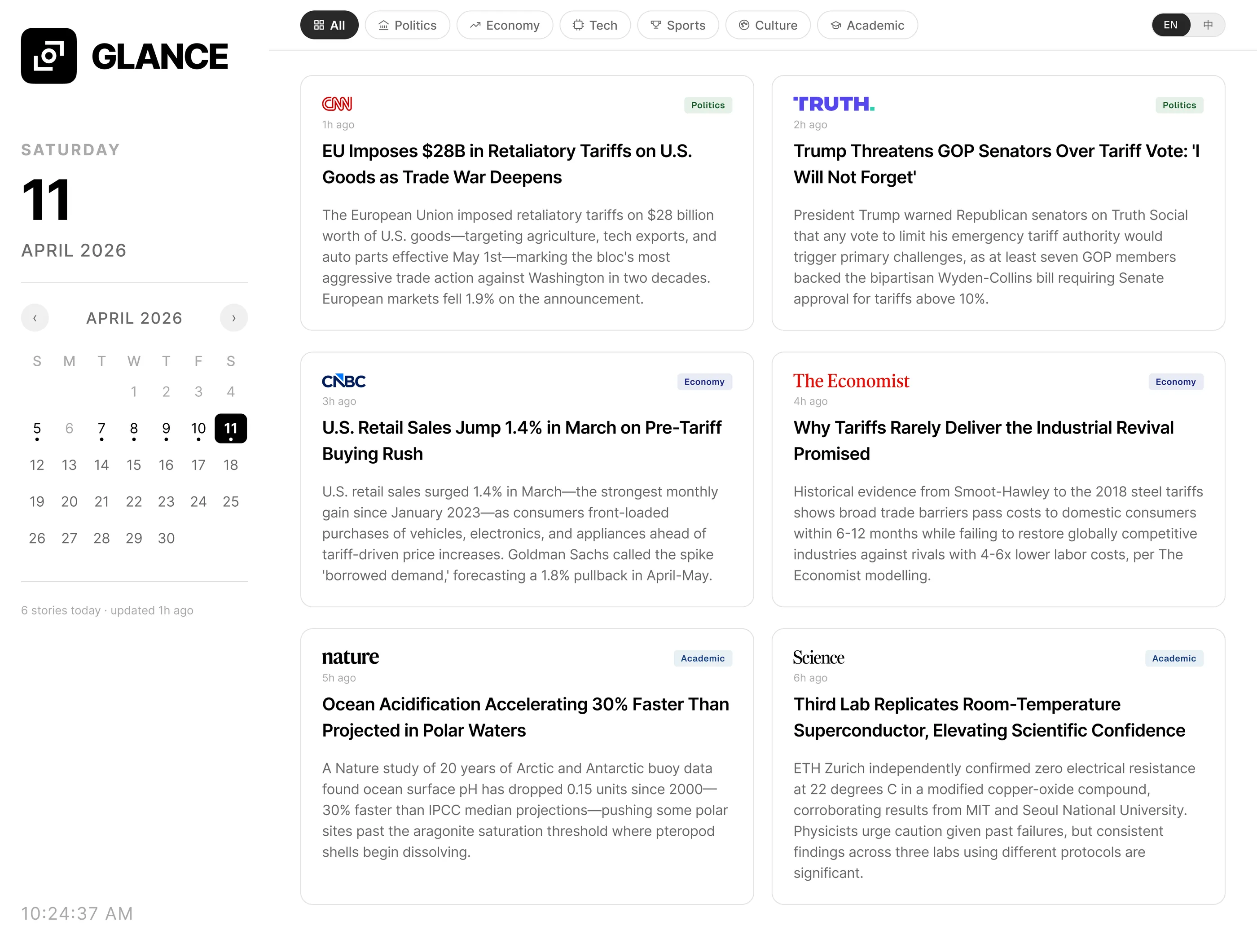
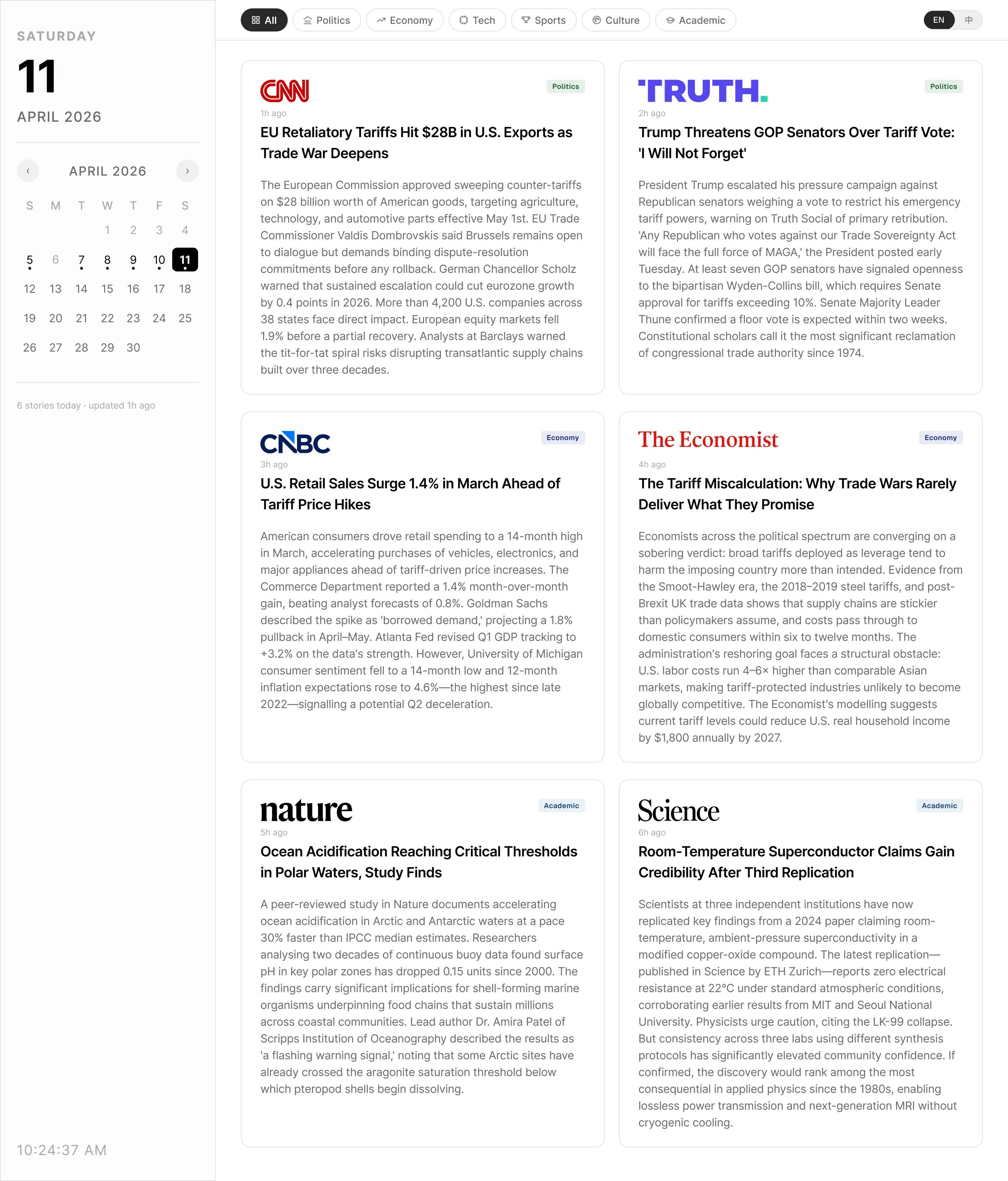
The six stories in the demo are a presentation device, not a product limit. The real model pulls up to three stories from each of six fixed sources, so up to eighteen items. It groups them into tabs by content category, not by publication. Source and topic don't map cleanly. A business outlet like CNBC still runs political news, so the grouping has to follow the story rather than the publisher.
Scope and constraint
Stop at ‘it compiles,’ or push further
Most AI-assisted design stops at “it compiles.” I wanted to push past that. I used Claude Code as a pairing engineer, not a generator, and I tracked where that broke down. The narrow editorial scope helped. Fixed sources, equal weight per story, a dense dashboard. My rule: ship a working Next.js prototype in two days, and keep every ambiguous decision mine.
I write prompts that carry the intent and the constraints. Claude Code builds the Next.js and Tailwind. Figma MCP returns the rendered state as a frame. I QA it against the reference spec, then sign off or write the next prompt. I keep the four roles separate for one reason. Claude Code can write the interface, but I still own the product decisions.
Five rounds in two days
Spec encoded as prompt, visual QA as comparison
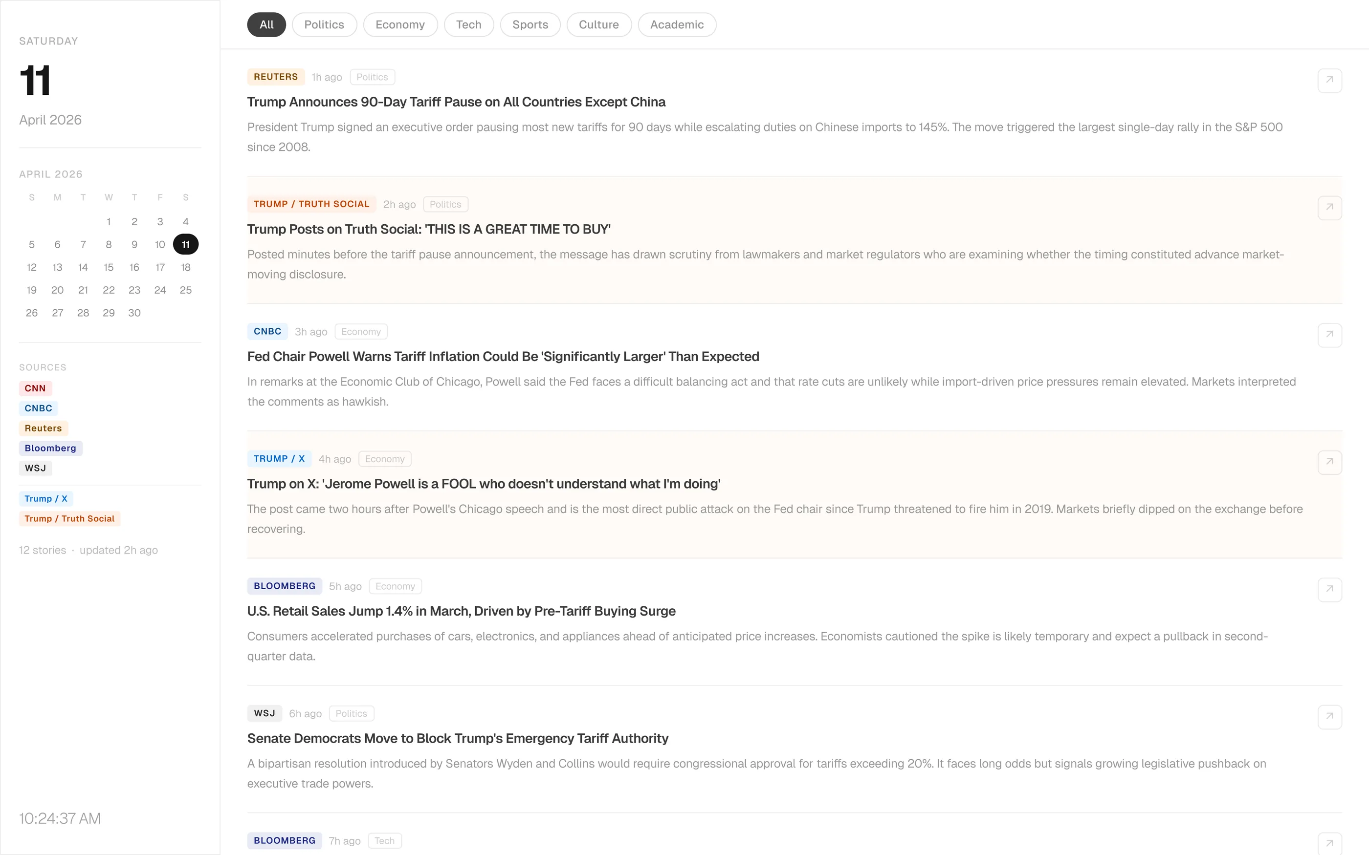
I wrote prompts that carried the spec, not just the intent. “Lock source logo height to 16px with object-fit contain” instead of “make logos consistent.” Figma MCP returned each rendered state as a frame, so QA became a visual comparison instead of a code review. The work AI couldn't own stayed with me. Calendar baseline, toggle alignment, and logo rhythm across six publications.
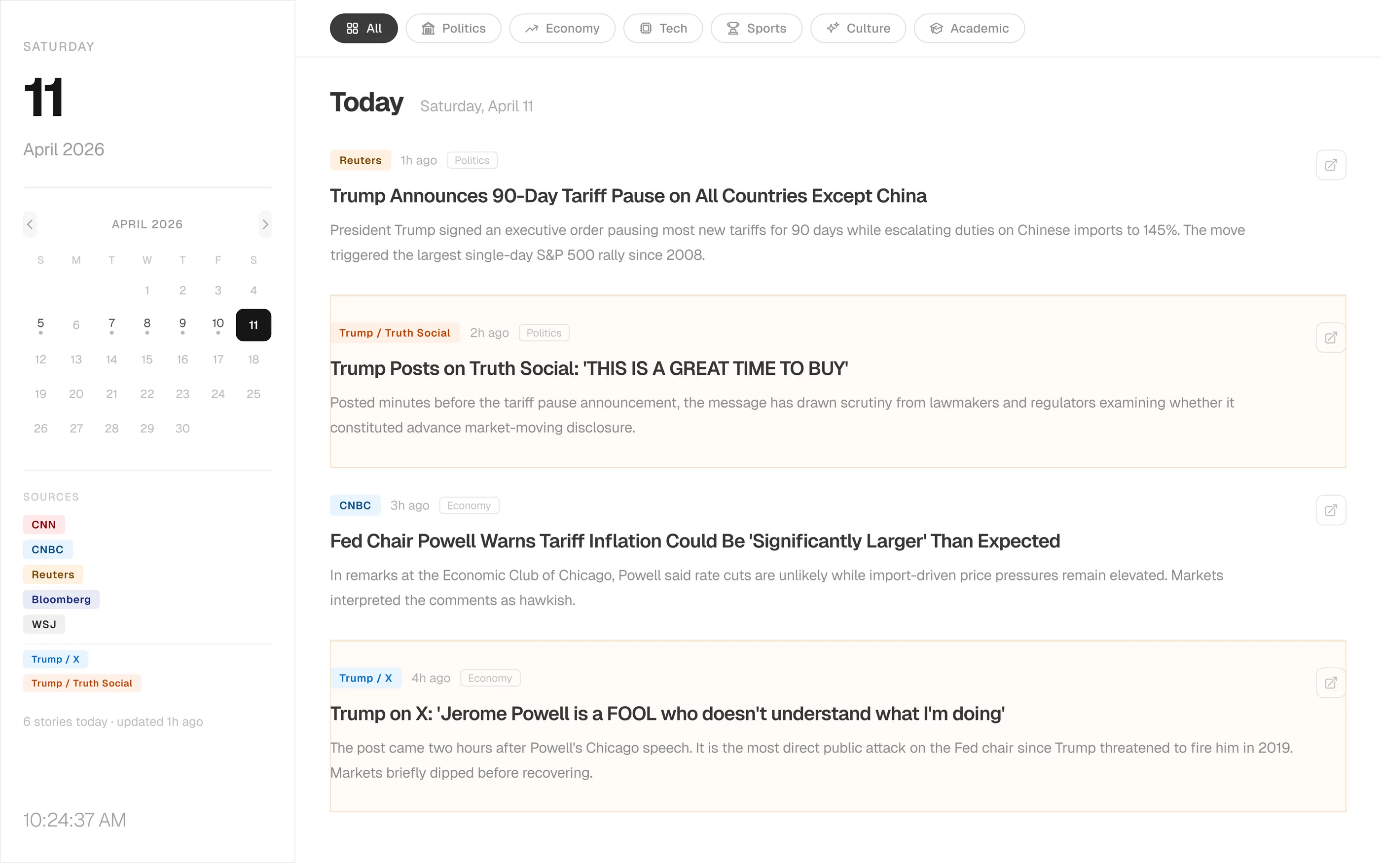
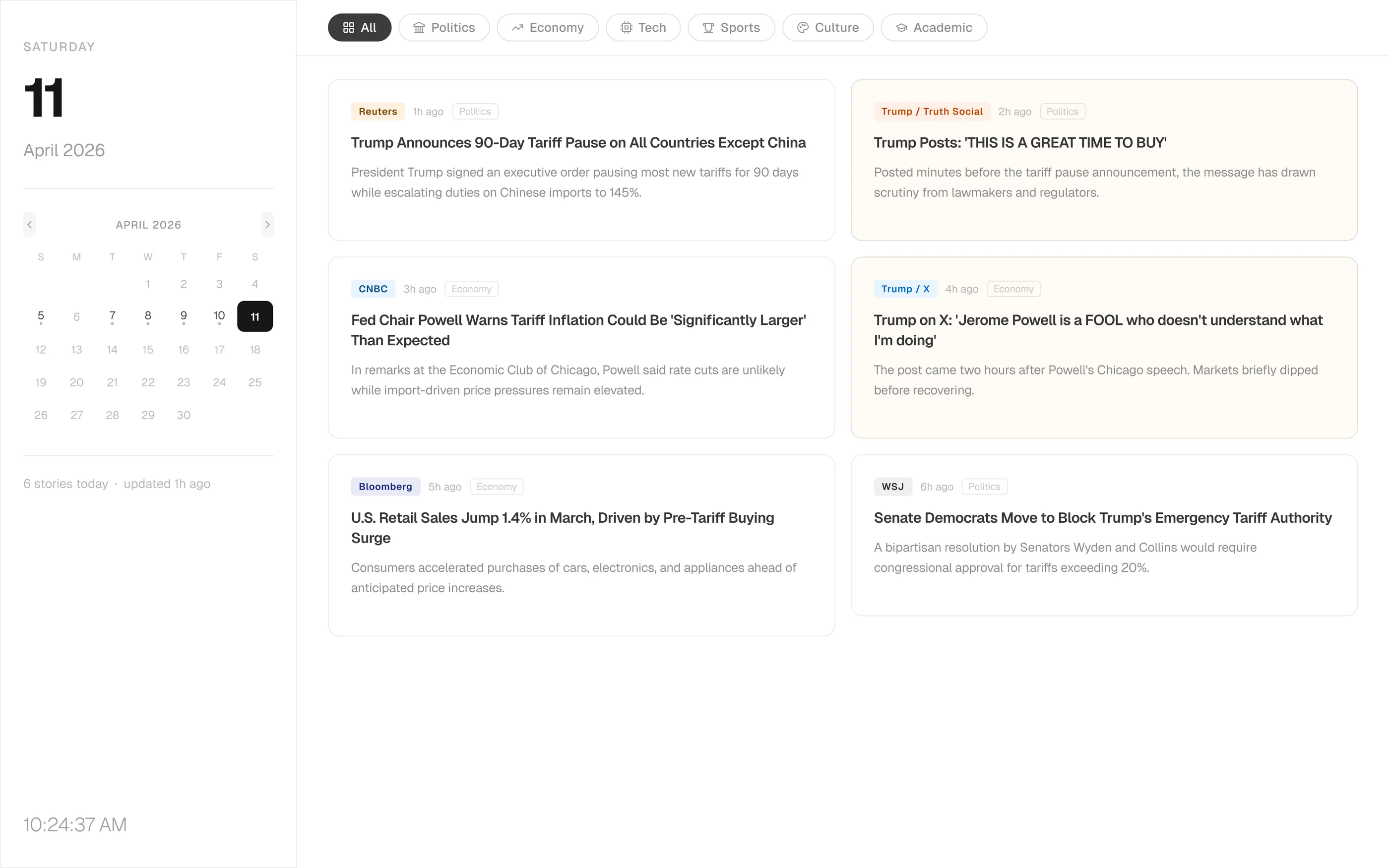
Round 1 (Dashboard). One prompt gave me a working list layout with eight event-driven sources. I kept it as a critique target. Round 2 (v2 Demo). I made the sidebar and its type scale bigger. News decays by the hour, so the time signals have to read first. Tabs got icons, the calendar got pagination, the header got taller. Round 3 (v3 Demo). A structural pivot to a 2×3 card grid. Six equal cards beat a ranked list when no algorithm is doing the ranking. The SOURCES list left the sidebar, since the badges already carried that signal. Round 4 (v3.3 Final). I locked the source list to six publications across politics, economy, and academia. The bilingual toggle landed with summaries written separately for each language instead of machine translation. Calendar date-dot rule re-normalized. Round 5 (v3.7 Padding Unified). GLANCE lockup, 16px logo baseline, 24px padding across cards. The dashboard read more clearly.
Daily use
What I reused
Glance isn't shipped. It's a tab I open every morning. The thing the two days actually gave me was the loop, not the product.
- The workflow carried over. Prompt → Claude Code → Figma MCP QA works on any dashboard-shaped problem I take on next.
- Prompt patterns became templates. “Lock element X to Y regardless of Z” is a shape I now reach for before I describe intent.
- Manual overrides mark the boundary. The points where I had to leave the prompt and fix layout in Figma mark the current line of what AI delivers without a designer in the room.
The evolution
Five rounds, at a glance
-
Round 1Dashboard
-
Round 2v2 demo
-
Round 32×3 grid
-
Round 4v3.3 final
-
Round 5v3.7 final
What I carry forward
Vague prompts made cleanup work. Specific prompts made better screens. That now shapes how he designs AI interfaces.